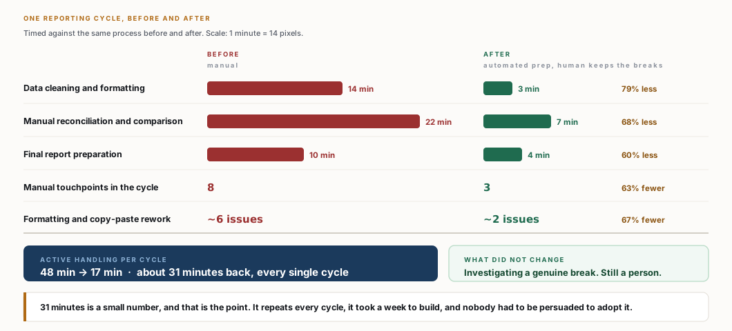
The cycle was timed before and after, activity by activity, which is why the saving breaks down into cleaning, comparison and report preparation rather than arriving as one round figure.
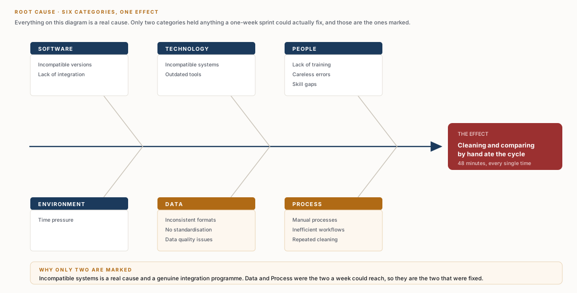
Root cause named six categories. System integration was genuinely one of them, and it was deliberately left alone. A one-week sprint that reaches for the hard cause delivers nothing at all.
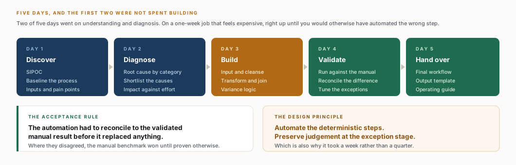
Five, and the last one is the reason it still runs.
Expensive-looking, until you consider the alternative: automating the step that was never the problem.
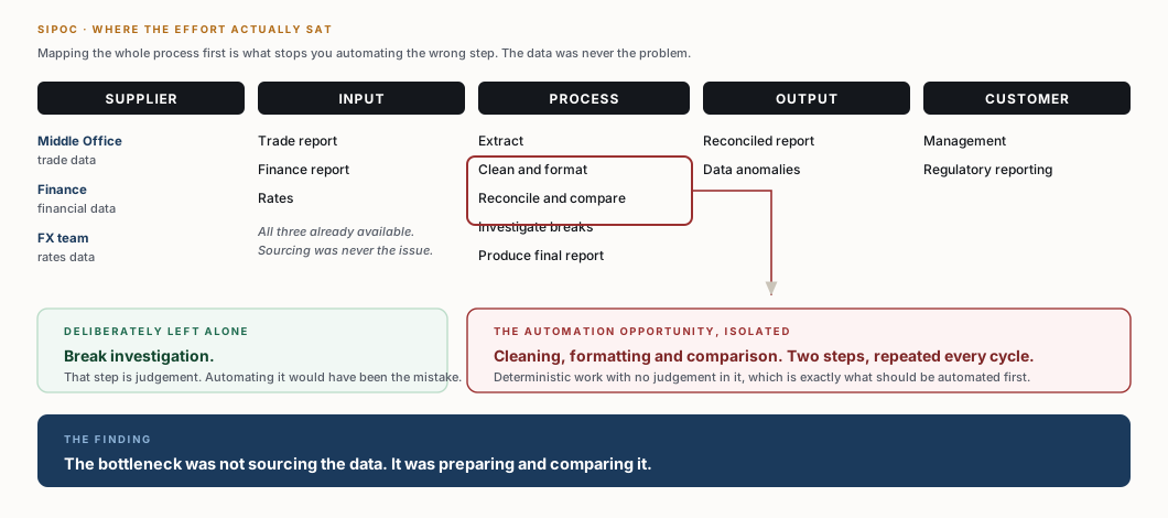
All three inputs already arrived reliably. The bottleneck was not sourcing the data, it was preparing and comparing it — and that is the part with no judgement in it.
Data and process held the quick wins. Incompatible systems sat top-right: real, expensive, and the fastest way to spend a week and ship nothing.
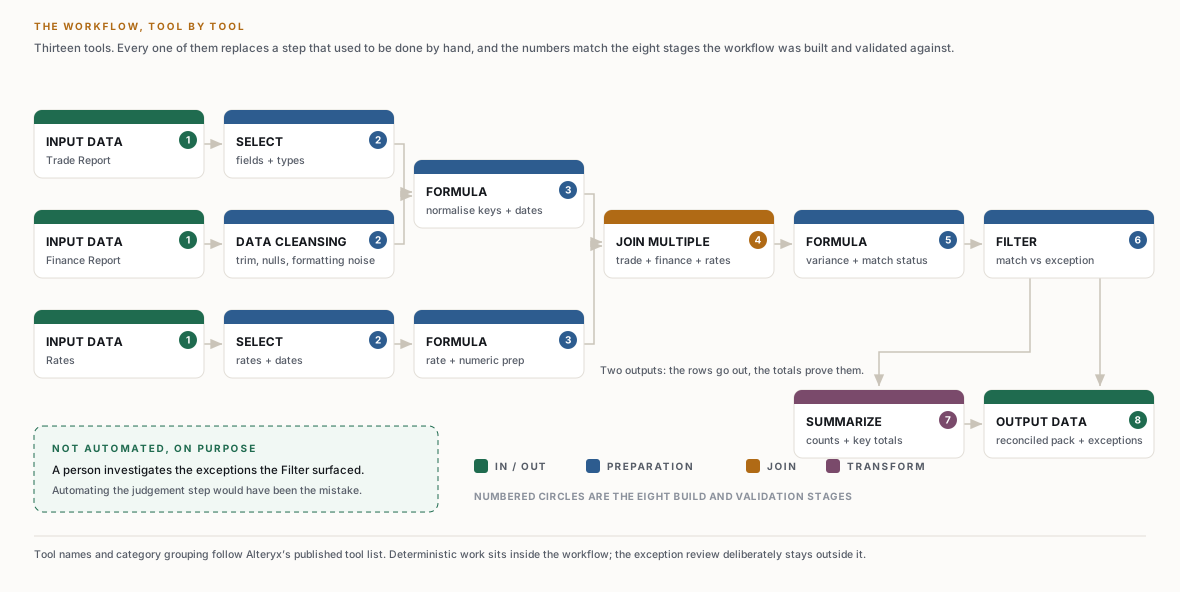
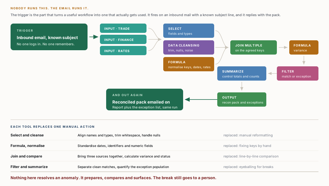
Thirteen tools, and every one of them replaces something a person was doing by hand. None of them resolves an anomaly — the break still goes to a human, with the comparison already done.
About 31 minutes a cycle, and the shape matters more than the total: the biggest cut was in comparison, the smallest in judgement. That is what a correctly scoped automation looks like.
Which is where most people stop. SCAMPER is a forcing device: seven prompts run against the same bottleneck, so the shortlist is wider than the first thing that came to mind. These are the working notes as they were written, one of them deliberately empty.
Replace manual data entry with automated extraction. Replace the spreadsheet with a tool built for the volume. Reassign tasks to whoever the skill actually sits with.
Bring the three sources onto one platform, and fold cleaning and validation into a single automated step rather than two manual ones.
More automation through cleaning, formatting and reconciliation. Fewer manual touchpoints. And cut the reconciled field set down to the ones that actually carry a decision.
Reconciled data can predict where discrepancies recur, and one common source file can feed several reports instead of each being built alone.
Redundant entry and approval steps, fields nobody reconciles against, and the waiting time between one person finishing and the next starting.
Move validation in front of data entry so the error never enters the process. The cheapest reconciliation is the break that was never created.
Nothing in the analogous-process prompt produced anything worth carrying. A blank on one prompt is a result, not a gap — filling it to make the sheet look complete is how a shortlist gets padded with options nobody intends to build.
For an automation this size, validation is one question: can it reproduce a reconciliation the business already trusts?
| Check | What had to be true |
|---|---|
| Source completeness | Row counts for all three inputs match the source files |
| Key integrity | Blank and duplicate reconciliation keys isolated, not silently dropped |
| Transformation | Dates, numerics and rate formats convert consistently |
| Join logic | Known matches join, and known breaks stay visible |
| Variance logic | Calculated differences agree with the manual benchmark |
| Control totals | Sums and counts consistent before and after processing |
| Output | Reconciled report and exception file carry the expected columns |
| Repeatability | Same inputs produce the same outputs on re-run |
The automation had to reconcile to the validated manual result before it replaced the manual step. Where they disagreed, the manual benchmark won until the business rule said otherwise.
Thirteen tools from input through cleanse, normalise, join, variance, filter and summarize to output, triggered by email and delivering by email.
SIPOC and root cause first, impact against effort second. Automating cleaning and comparison rather than reaching for system integration is why a week was enough.
Cleaning and format alignment moved into the workflow, so the formatting slips that caused rework stopped being possible rather than being caught later.
Five days. Two of them before a single tool was placed on the canvas.
Everything above is the bottom line. If that is what you came for, you already have it.
What follows is the full working: 6 diagrams and 8 sections of working, the analysis behind each decision, and why it went that way instead of the obvious way. It is long on purpose. It is written to be checked, not skimmed.
Only wanted the overview? Stop here. You will not miss a single result — every number is already above this line.