Where the bottleneck lived
What shaped the decisions
Volume is not severity. One material carried 72% of total deviation, and had the best median in the plant. The column everyone was reading pointed at the innocent suspect.
What they needed, and why it mattered
Five requirements. Each one has a business consequence attached, and each consequence shows up in the numbers at the top of this page.
-
01
Make a small run and a big run comparableLosing 300 units against a plan of 100 is a disaster. Losing 300 against a plan of 5,000 is a rounding error. The existing measure treated them as identical.Until this was fixed, every ranking was wrong and any money spent would have gone to the wrong place.Derived requirement · the blocker to every other step
-
02
Answer their actual question: machine, person, or material?Those were the three suspects the client named. All three had to be settled with evidence rather than opinion.A clean answer on all three is what let them stop guessing and cancel the material programme.Client-specified
-
03
Use records they already had. Touch nothing on the lineNo new sensors, no instrumentation, no production stoppage to run the study.Zero capital spend and zero lost output to find where the money was going.Constraint
-
04
Leave them the ability, not just the answerThe word "simple" appears in the objective, the scope and the deliverables. Three times. They were buying a capability they could keep.No repeat consulting fee. The next loss gets found in-house instead of costing another three-month study.Client-specified · stated three times
-
05
Say where to spend, and where not toA shortlist is only useful if it also removes things. Clearing a suspect is worth as much as naming one.The "do not touch" line is what protected the six-figure material budget.Derived requirement
First I had to fix the unit
Raw deviation is not comparable across batch sizes, so I defined a measure that is.
POM = Deviation ÷ Planned
| Run | Planned | Deviation | POM | Read as |
|---|---|---|---|---|
| Run A | 100 | −300 | −3.00 | Severe |
| Run B | 5,000 | −300 | −0.06 | Minor |
Data prep  →  Deviation  →  Point of Magnitude  →  keep only unfavourable
                                        ↓
                              Normality test
                              ↓              ↓
                          normal?        not normal?
                              ↓              ↓
                           ANOVA      Kruskal-Wallis
                              ↓              ↓
                        Significant factors only
                                        ↓
              Boxplot + interaction plot  →  ranked actions
Five gates, each one narrowing the search
Every step asks one question, answers it with a chart, and only then moves on. Nothing advances on opinion.
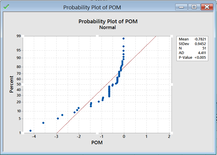
The points bend away from the fitted line and P falls below 0.005. The data is not normally distributed, so ANOVA would have been the wrong test to run.
Decision: switch to Kruskal-Wallis, a non-parametric test, rather than report a result the data cannot support.
| Factor | H | DF | P | Verdict |
|---|---|---|---|---|
| Equipment | 30.36 | 14 | 0.007 | Significant |
| Operator | 26.52 | 11 | 0.005 | Significant |
| Material type | 5.23 | 2 | 0.073 | Not significant |
Two factors survive. The material does not. That single row is what cancelled a costed investigation.
Ranking by total deviation would have said the opposite. Material Group 2 carried 72% of all deviation — but it appears in 29 of 51 records, and its median is the best of the three groups. High volume, low severity.
Volume is not severity. The column everyone was reading pointed at the innocent suspect.
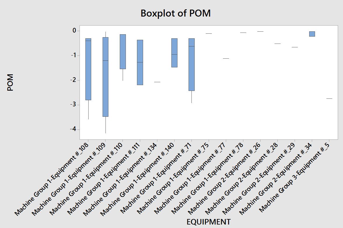
Equipment 108 and 109 carry the widest spread of any machine on the line. Wide spread means unpredictable, and unpredictable is what forces a material buffer.
Decision: both go on the service list, alongside Equipment 71 which showed very high deviation under one operator.
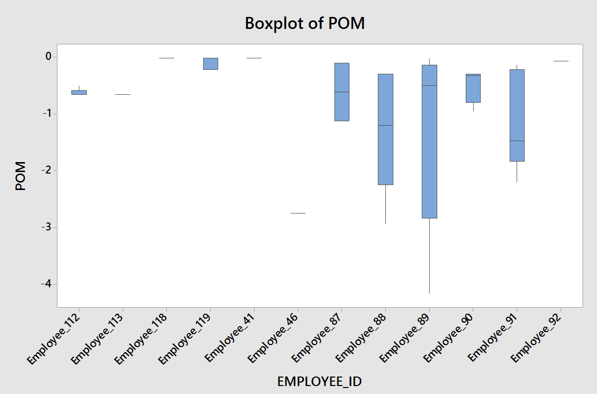
Three operators separate clearly from everyone else, both in range and in worst case. At this point the obvious conclusion is that three people are the problem.
That conclusion is wrong, and the next gate is what proves it.
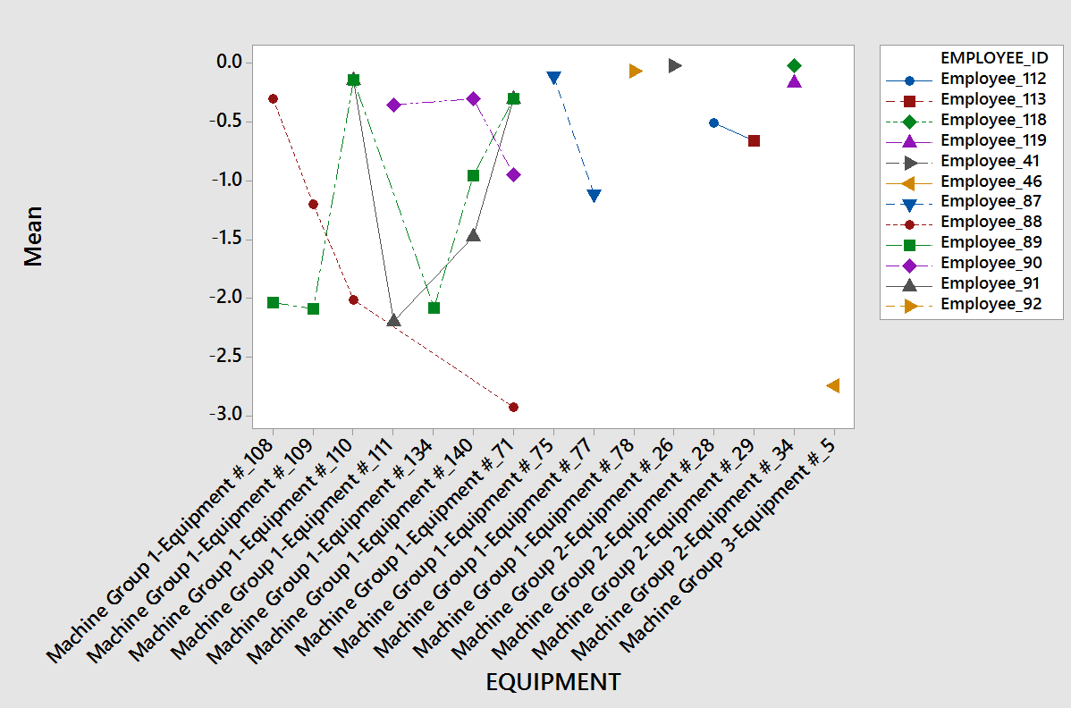
None of the three was worse everywhere. Each failed on specific machines and ran normally on the rest. Only an interaction plot separates those two facts.
| Operator | Runs over plan | Severity | Machines it happened on | What the data showed |
|---|---|---|---|---|
| A | 6 | Critical | 108 109 140 | Averaged −2.0 POM on half its runs. Worst on both range and worst case |
| B | 4 | High | 110 71 | Inside the Pareto top 20%. Equipment 71 carried very high deviation |
| C | 4 | Contained | 140 | Outside the Pareto top 20%. One machine only, fine on every other |
| Three pairings | 14 | 27% of the failures, 77% of the loss | ||
Operator C failed on one machine and was fine on every other. Fire C and the loss stays. Retrain C on machine 140 and it goes. You do not remove the people. You fix the pairing.
Minitab and Excel were run independently using different techniques — Anderson-Darling, Kruskal-Wallis, boxplot and interaction on one side; Pareto and PivotTable on the other. Both converged on the same shortlist.
77%, and it reconciles exactly
Retraining three operator-and-machine pairings and servicing two machines removed 77% of total material over-use. That figure is not an estimate laid over the study. It reconciles against the measured population, line by line.
| Group | Events | Avg POM | Total POM | Share |
|---|---|---|---|---|
| The 3 pairings + 2 machines | 14 | 2.19 | 30.7 | 77% |
| Everything else | 37 | 0.25 | 9.2 | 23% |
| Measured population | 51 | 0.782 | 39.89 | 100% |
The bottom row is the study's own measured mean and total. The split reproduces both. And 2.19 sits directly on the documented behaviour of the worst pairing, which averaged 2.0 POM on half its runs.
The 23% left over, and why we stopped
The remaining 23% is 37 events averaging 0.25 each. Low severity, spread thin, no single owner.
The first 77% had names on it. The last 23% does not. It has no dominant cause, so it is not an investigation problem. It is a control chart problem — you catch drift, you do not hunt for a culprit.
That is why the plan ends with control charts and a monthly re-run rather than another study. The method tells you when to stop investigating.
The gap was behavioural, not material
Material type tested insignificant. Equipment and operator both tested significant, and the effect concentrated in specific pairings. A machine that runs clean for one operator and badly for another is not a broken machine. It is an unwritten technique difference at the withdrawal step.
Severity, not frequency
Those 14 events are 27% of the population but 77% of the loss, because they run nearly nine times worse per event than the remaining 37. That ratio is the entire argument for Point of Magnitude. Counting events would have ranked them almost last.
Where 77% sits against the Pareto forecast
Pareto analysis run during the study put the top 20% of contributors at five named items and forecast that they drove roughly 80% of the outcome.
The measured result came in at 77%. The forecast was slightly optimistic, which is what you would expect — Pareto is a rule of thumb, not a measurement, and the residual 23% is real.
The value of the forecast was never its precision. It was that it named which five, before any money was committed.
What produced each result
Three deliverables, and each one maps to a number at the top of this page.
A ranked critical-areas list
Five named items with recommended interventions. It told the plant exactly which three pairings and which two machines to touch, so the fix was surgical instead of plant-wide.
A method that can clear a suspect
Repeatable deviation analysis, gated at every decision so the answer is never an opinion. It proved material type insignificant at P = 0.073, which is what cancelled the replacement and re-sourcing programme.
A targeted intervention, not a programme
The interaction finding turned "three operators are bad" into "three pairings need work". Retraining and machine servicing at those points is where the productivity gain came from.
A work instruction manual — the procedure plus the principles behind it. The plant re-runs the analysis itself, so the next loss does not need another three-month study or another analyst.
Do not re-qualify Material Group 2. Telling a client what not to spend money on is worth more than another chart.